Monday, February 21, 2005

Pressing Amounts of Work
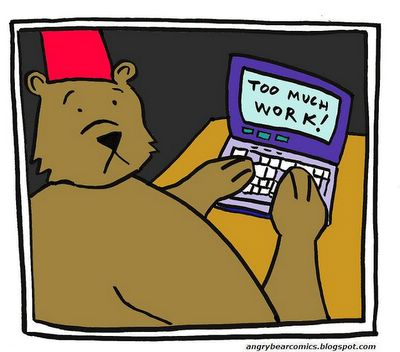

Pressing Amounts of Work

First off, this is not the comic that I intended for today. Originally, I wanted to continue the camping story arc, but I haven't had time to fully write the script or do the necessary drawings. The longest element to the whole process the way I have been doing is the inking with the India Ink. Good Grief, that takes forever! The brush pen has been helping out in that regard, so it was a good investment. I think it looks best when I combine it with the computer color as I have done here. In fact, even though this comic did not take as much time as some of my others, it may be among my best looking. I guess I am finding my own best creative process.

You may not have noticed, but this is the third picture in this day's update. Be sure to check out the Character Sketches and Dana's Circle picture below for todays sketch. The common element to all of these pictures is that they were drawn several weeks ago, but not uploaded into the computer until today. The reason for all of this is that I am swamped with work. I have to read several books (about 4) and write 30 "good" pages of academic writing in the next three weeks, and I am already behind. But my sense is that the key to getting all this work done is develop a routine and stick to it. Part of that routine will be this webcomic because I don't to burnout on work too quicly, even though I focusing more intensely on it than I have before.

Special Note: You may not have noticed yet, but I have changed the poll on the left from "which day you want the comic to update" to "which character would you like to see featured more frequently." I have determined to have a posting on the site by Monday. This will give me some time to work on the comic over the weekend. However, if you are a morning person, the best day to check the site for an update may be on Tuesday. I will try to be more diligent and regular about posting. Please vote in the Poll. And if you're feeling more adventurous, send me an E-mail. Zeb might bite, but I swear I don't!

Character Sketches


Character Sketches

If you can't tell exactly by the style, I drew these pictures awhile ago on 3 x 5 cards with an ink pen. In fact, the Bossy and Clark Doodlecoop pictures are among the first sketches of those characters ever. Bossy has a blouse on that is really more "busy" than I intended, and you'll notice that Clark does not have the glasses I put on him on later. I think I am also going to give up the Angry Bear Homestead idea, but I am too sure. It would be a cliche to have them live in a tree, and seems a little weird to have them live in a cave, but I don't like the house that much either. Something will change over time eventually. There are some pictures that I did not scan of Zeb in shorts that look incredibly goofy, and some pictures of a cat character who happens to be Buddhist. I might post those later. (By the way, I adjusted these pictures on the computer, which is why the outlines of the 3 x 5 cards are not showing up.)

Dana's Circle


Dana's Circle

Okay, this picture is really big. In fact, it is bigger than I expected. So while I am getting technically better with my Graphic-Photoshop-type-Manipulation tools, I still have a lot to learn. But on the plus side, this size of image will work really well for a T-shirt in the cafe press store. (Remember if you have specific requests for a T-shirt with a particular image on it, just drop me a line.)

My question for you readers is whether or not you think I should replace the image on the sidebar with the image above. I think that eventually, it would work really well to put all of the principal characters in their own circles just like Zeb is in the top sidebar. What do you think, should I switch them. I am leaning towards doing just that.

Monday, February 14, 2005

An Accident

(Click Comic for Larger View)
An Accident

Zeb is yet again surprised by his parents in their R.V., but the Birthday celebration should go on in the next few comics. I have some ideas for some new characters thanks to some feedback from a real close friend. I'll probably be introducing a new character because of it. Remember feedback is greatly appreciated, so if you can spare a moment leave a comment. Blogger has improved their commenting system, so it should be easier to leave an anonymous comment if you prefer. But, if you want, you can also send me an E-mail to the address in the sidebar.

As for the technical aspects of the comic, I used the ink and the quill to do all of the outlining and for the larger areas of black, I used the brush pen. That made things go a bit quicker. I think it looks okay. I fooled around with the image in my photo manipulation software to try and make the blacks look all of the same. The brush pen always looks brown compared the intense black of the India ink. Oh, well. If you have any suggestions about how better to do this, again, let me know. (I will try to change the vote question on the side soon once I get the time and remember how to do it. It may be a couple of weeks and will involve tinkering with the template.)

Sunday, February 06, 2005

Behind the Scenes


Behind the Scenes

Sorry about the week delay in posting, but things have been super busy with work lately, so I have not had much time to work on my comic. I do have one that is about half drawn that I hope to have posted in the next couple of days. I hope you are still having fun reading these. If you have any suggestions for improvement, story-arcs, or just want to say hi, remember, you can post an anonymous comment below, or send an e-mail to the address in the side bar.

As for this posting, this is a picture of the materials that I use to draw the web comic. The top sheet is the actual inked comic in a near finished state. I next upload it through my scanner, make the blacks darker by adjusting the "curves" in my generic photoshop program, and digitally erase any of the stray marks or mistakes that I may have made to the image itself. However, before the inking stage, I write out the script and draw a very rough guide of how I want the comic to appear on the page in a blue, non-photo pencil. This is the sheet in the lower right hand side of the photo. (This special pencil should not show up in the image scan, but I erase the marks anyway, probably because I am not using the pencil right and the marks tend to show.) The pens, the ink well, the pencil sharpener should be self-explanatory. However, I suppose I should point out that the bottom pen is a "brush pen" that is supposed to mimic a what could be called a painter's brush. Instead of the quill and ink, I used the brush pen to draw the comic shown in the previous posting. I am not sure I like it as well, but this might have more to do with my not being comfortable with it or my technique yet. If you have any questions, leave a comment, and I will try to answer in a couple of days or so. Also, look out for the new comic soon.