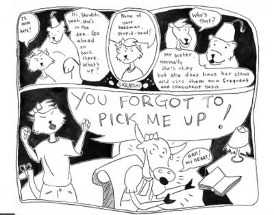
Skratchi's Lament
(Click comic for larger view)

Skratchi's Lament
Well, crap. After some work on this comic, it turns out that it will not post like I really want it to. Therefore, to properly see this comic in all of its glory, you will need to click on the image and then expand it with the hidden lower right-hand box (but only if you are using internet explorer). There are some instructions in the sidebar here which pretty much say the same thing. If anyone knows a better (and free!) way to do this, or if they know of other browser idiosyncracies, drop me a line in the comments. Otherwise, I am going to continue to fool, like a fool, with the form until I get it right. Ideally, I would like to have a large image appear in the center of the page which no-one has to do anything except look to see it properly.
As you can tell, I went with the "pixie" hairstyle for Skratchi. Thanks for all of your comments. They really helped shape how I see Skratchi as a character. As for the other hairstyles, I discovered that the "mod" version looks too close to a minor character on the PBS Arthur cartoon. Therefore, I decided to play it safe and not use it. What do you think? Is Skratchi what you had in mind? You can drop me another comment below to help shape her character if you wish.
As for things here on the cartoon front behind the scenes, my laptop is experiencing technical difficulties, so next week's comic may also be late. (The AC adapter has a frayed cord which finally blew up in a shower of beautiful orange sparks. I have to wait a couple of weeks for a new one.) I am going to continue to shoot for a Friday update, since that is what the majority of readers seem to want, but it might be better to check back on Monday for the time being as I can catch up more on weekends. Anyhow, thanks for reading and enjoying. Until next time!


4 Comments:
I think it turned out well. I like the hair and the character. The detail definitely shows up a lot better in the big window like you said. Yes, I look forward to the next installment. Also, what do you think about adding a little color in the store items, or even in the comic (like one of the earlier ones)? As for the day of the week issue, I think it is fine to be a little flexible from week to week.
The color thing may be something that I experiment more with in the future. Right now, the comics are in black an white because they're hand drawn in ink. If I can purchase some good photoshop software, I might switch to color for every comic, or even do color just occasionally. The color comic I did here was nice, but kind of limited as I drew it entirely in Microsoft paint. Definitely, it is not one of the fanciest programs out there.
As for the postings, while the voting seems to be going for Friday, according the web statistics, more people are looking at the site on Monday. Hmm. Go figure.
Monday is most likely the day people will check for comics, so maybe any time during the weekend would be suitable for posting time.
Another thing, when using Opera (my favorite web browser) you don't have to "click to enlarge" to see it in full size. Maybe there is a setting somewhere in i.e. to change that feature.
Post a Comment
<< Home